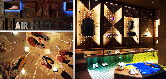
I was visited this store in Los Angle, USA in 2011. It was 2 years ago, but it still gave me very dept impressed. Artists and designers use colours to create texture and visual impact to public. the black wall bring the pure blue and red are lively.The pure blue contrasts of the vivid red, bring out the red shiny and more outstanding. The left image gave 3D visual effect to viewers by using the red colour lines. The right image was showing the process of an jumping athlete by hanging shoes in different position. This special visual display is only physical store can carry it, online store will lost the chance of displaying this amazing colours works.
Most of the online shops are display their product in a white background because this is a effective way to show the colours of the products and details. However, compare to the right image. Physical store can divide different sections of products by using different colour, for example the right top image is a successful case. The second image of the right picture, designers use the colourful products to build a shape, display their logo in 3d effect is very cool idea.
Because online shop has limited width space in a flat web page, so they usually use colour to create a unique shape of each product. It's very hard to shows their difference. Every products are just like icons in a same background, they are almost the same angle, less gradient colours, higher contrast. On the other side, physical store displays product in different angles, different sections, different positions and different textures' of background.
Lighting effect is a big different between physical store and online store. Designers use different colours of light to create protean shape and sections. A clean and simple colour shape bring a cool style to viewers.
Above is a very successful Nike online shop, it use colour to catch customers' attention, also use colour to high light their products and management different sections. In website for branding, colour is a very important part to bring details of all materials, colour also creates emotional senses, it gives a high tech impassion to audience. Good designers can create a strong visual impact website by successfully using suitable and creative colour palette.


