

 Matt Dixon / Facebook photo

The views don't see any face expression, but all the views can feel the sad and lonely. This is because the artist successfully creates the sad atmosphere by using suitable color scheme. The feelings of sunset, yellow, orange, red and a little bit of purple, can creative the empathy of hopeless and loneliness. Also the dark brown red rectangle and circle, also bring the message to viewers these are important elements of this art, so viewers can see the problem very obviously, the robot is looking to his heart, and he is missing a heart. Moreover, the dark shadow and the light setting is used for creating the lonely feeling to viewers. This is great way to use colour to point out the message what is the artist wanted to tell the viewers. He doesn't point it out by using words, yet by using colours.

Outdoor advertising poster / India
The Creative Team:Developed at Mudra Group, India, by executive creative director Joono Simon, art director Vinci Raj, copywriter Akhilesh Bagri, photographer Mallikarjun Katakol, with retouching by Sathish.
This is the successful poster of uses colour and image to send a serious message to public.
We can see the blood was splashed from a phone. It is a lot of blood, yet not too much, just right amount of blood. It doesn't cause too violent, yet it's very serious. Viewers can feel the biggest shock form the red, and then from the image's face expression. The image is almost close to white and grey, so it's base on real yet more in feelings way. This colour strategy is for building the sad and horror feelings. These images capture the dangers of Distracted Driving, telling the story from the other side of the conversation on the non-Driver’s point of view. Without using any words, we still can understand what's going on here. With the tag line:"Don't talk while he drives." We totally understand and we will be afraid if this happened to us. This is probably one of the best advertisement campaigns ever devised to combat Distracted Driving, and ranks way up there along with the famous British PSA video on dangers of Texting While Driving.
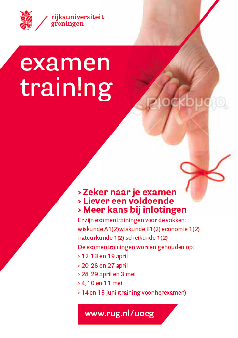
This poster colour scheme is red shapes and types on a white background; and the image is a red knot on a finger.
Base on the colour scheme and the image, it keeps telling me this may be a hospital poster, blood donation or a Social welfare Poster. In fact, this is a academic poster of exam training, so the colour red drags viewers to a wrong direction of the understanding the poster. Also the red knot on a finger has no meaning of any concept of exam or training course, so this image doesn't sent the right message to viewers. Overall the layout of the poster is very good, so if keep the layout and change the red polygon to other colours which represent school, academic, exam or train. I think navy blue(as same as the UBC is using ), orange( as same as the Langara's using) and deep green will be a good choose, because these colours has meanings of academic, professional, study, school etc.
sources:
https://www.facebook.com/photo.phpfbid=10151836477297506&set=a.114820017505.126275.104544627505&type=1&theater
http://www.transportgooru.com/2010/05/dont-talk-while-he-drives-bangalore-city-in-india-delivers-distracted-driving-message-with-stunning-visuals/
http://www.rug.nl/about-us/how-to-find-us/huisstijl/toepassingen/informatiedrukwerk/poster?lang=en


