Ola Kvernberg
http://www.olakvernberg.com/

-Interactive logo
-Day and night mode switch function
-Sketch book style
-Menu
http://www.olakvernberg.com/

-Interactive logo
-Day and night mode switch function
-Sketch book style
-Menu
Imaging that 10 years later, I will be running a home based design workshop - Jing Design Studio, creating beautiful pieces of digital art works for many clients from different countries.
To make elegant design, there will be mixed use of my own elements from hand craft and hand drawing. For example hand drawing typographic, water-colour background, origami home page, paper art title etc. They will be more than flat design, it should be with responsive and interactive design.
I may travel a lot at that time, exploring various cultures while improving my design techniques. Maybe I will be living in Europe with my family 10 years later.
Adam Hartwig
An interactive Home page
http://www.adamhartwig.co.uk

Reklamebyraet NeoLab
A diagonal compositions layout gallery
http://neolab.no
 It's good organized, clear hierarchy by using colour and size, and the 45 degrees square layout can easily group all the same level elements together, creatives relationship between work pieces and negative space. It's a quite interesting looking.
Nick Jones
A cool way to explain each project
http://www.narrowdesign.com
 This is a three column grid layout with different width, this layout create nice balance for the page, also we can easy to see the hierarchy of contents. It's interactive design too, if audience movie the images horizontally, they can see more content. It seems a cool way to explain details.
Monokroom
Info graphic in interactive way
http://www.monokroom.com
 Again, very nice hand drawing font. This website uses interactive moving gears to show the relationship between their 4 sections information. Audiences are very easy to understand these 4 sections are relate to each other.
Mathieu Jouhet
Business card style
http://mathieujouhet.com/en/works/illustration-web-and-ui-design-cookicaster-com
 Very clean design, business car style with nice background texture. Also I really like the big icons navigation bar, there are easy to use and fun.
An interactive Home page
http://www.adamhartwig.co.uk

It's a interactive home page design. I really like the hand drawing typographic style, what is written is the designer's personalty, which is an amazing idea to show what the designer love about and good at. So this inspired me, maybe in the future, I will do similar design for my portfolio website.
Reklamebyraet NeoLab
A diagonal compositions layout gallery
http://neolab.no

Nick Jones
A cool way to explain each project
http://www.narrowdesign.com

Monokroom
Info graphic in interactive way
http://www.monokroom.com

Mathieu Jouhet
Business card style
http://mathieujouhet.com/en/works/illustration-web-and-ui-design-cookicaster-com

I choose to do Concept design/ designer because it relates to what I'm interested in. As the same as fine art and illustration art, the techniques are closer and, we ever consider there are overlap areas, but their focus is very different. Fine art and illustration is to create polished artworks on its own. But the purpose of Concept design is to quickly explore “CONCEPT”, build the connection between the story and visual result to consumers what they need/want to know. It doesn’t need to be any art pieces, the goal is to convey a visual concept, idea, light setting and mood for every different media, for example movie, game and comic book etc. I choose to do Concept design is try to let people know more about it, and discover more about it.
Mood board

(1) In my mood board, I focus on concept developing, such as image 1 and 4.
(2) Concept art and concept designer are closely relate to each other, so it just feel "a man behind the character ", so i would like to use face overlapping to bring this idea. half face is the character they creative, other half it's designer herself/himself. just like image 2, 8 and 9.
(3) The image 5 inspired me for the following "2 page magazine design" design.
(4) Image 6 is the one of my One of my favourite Concept artist

My color style guide is orange with black, gray and white. Orange is a vitality colour, it gives the energy to audience. When people see orange, it encourages them to think more, and improve their interested in learning.
I chose ANAGRAM NF is my title font because it has a little decoration at the letter makes it playful and joyful. This is very match my design, I'm try to explain a topic, maybe not that much people know about concept design , concept art and concept artiste. But this is a fun and creative subject, so a playful font can delivery my design goal, concept design is a fun and Relaxed topic.

This is my 2 page magazine design
I used polygon shapes in a grid system. the polygon shape means concept design is unlimited style. Most image in here is eyes zoom in picture because this is very easy to get reader's attention, also i tried to create eye contact with audience. Therefore, when the see there images or read the articles, just like the concept artist was talking to them.
I didn't involve to much text, I just brought the main points: the goal, the key and the difference. very clean and playful layout. this part is very close to my mood board, I get the inspiration form my mood board image 2, 8 and 9. At the middle of 2 biggest image, there are the same angle of character and designer, so reader can realized the art work and this person has connection. after they read the articles, reader will know the concept artwork is done by the concept artistes.


2 page magazine design
Click Concept Design web page


This is the website I designed and created. (1 page with 3 sections. ) It totally follow the colour guide and font from my design guide.
This is a contribution website, introduce what is Concept Design, and what's the difference? So using orange for a title, orange represent open mind, so this colour can encourage them stay longer and discovery more.
The 2nd page I use orange to create professional looking, so I provide the idea, professional concept designers create professional concept arts.
The last page I post a concept artist and his artwork, he is Simon Otto, One of my favourite Concept artist.
Overall the website, I use orange to keep my brand and coherent style. 2 page magazine design print/ digital and the one page website all keep the same style, using the same font and same colour guide.
Resources:
toothless: character of "how to train your dragon "
http://darksuperhero.blogspot.ca/2010/03/toothless.html
moodboard image 3, 4 & 7
from book<the art of dreamworks how to train your dragon>
mood board image 2:
http://www.adhamdannaway.com
mood board5:
http://creativexcess.com/page/58/
mood board 8:
form< iron man> official website
mood board 9:
time magazine cover
Simon Otto's image is from his bolo:
http://simonotto.blogspot.ca
The image is link to:
https://blogger.googleusercontent.com/img/b/R29vZ2xl/AVvXsEgFO8-MXvHpwXdlcBac-p0sOXFJtgbj0nhU5wHUm_HL3ajZ3aGYu1Cnd_HR1lfy0-lJyr5v-_-6v0cAegNNpiUr-RHELpRl_gLRCLLPhrhuoUi0kHs040IJ767N4HK779tV836_lUqgsdk/s1600/Simon_Massimo_portrait.png
web 1st page:
concept designer: Park Jong Won
http://s.cghub.com/files/Image/491001-492000/491509/190_max.jpg
web 2nd page: artistes
http://www.conceptarts.com

In generally, blue represents ocean and environment friendly, also blue is plastic bag/bottle colour; therefore, blue is the perfect colour for this poster. The orange shirt is the Complementary colour of the blue, so it creates contrast. Orange also brings the character's emotion, he looks like very happy and enjoy the seafood, but this poster create a moment: when a person is picking a seafood up, and trying to enjoy its fresh and taste, does he realize that everything go into the ocean goes into himself? Plastic in the ocean concentrates and carries persistent organic pollutants such as DDT, PCBs, mercury and other toxins. The bright yellow in here just like a light bulb, hight light the title of the poster, and it also reminds people about the ocean pollution. Even though, this image and colour pallet looks very happy, but it's also telling a sadness fact to public.

ps, this is the older poster I created it include the same concept; but I didn't create any plastic sushi, the two images I borrow form internet to do school assignment, images resource I have already written down in the poster footer.
 Matt Dixon / Facebook photo

The views don't see any face expression, but all the views can feel the sad and lonely. This is because the artist successfully creates the sad atmosphere by using suitable color scheme. The feelings of sunset, yellow, orange, red and a little bit of purple, can creative the empathy of hopeless and loneliness. Also the dark brown red rectangle and circle, also bring the message to viewers these are important elements of this art, so viewers can see the problem very obviously, the robot is looking to his heart, and he is missing a heart. Moreover, the dark shadow and the light setting is used for creating the lonely feeling to viewers. This is great way to use colour to point out the message what is the artist wanted to tell the viewers. He doesn't point it out by using words, yet by using colours.

Outdoor advertising poster / India
The Creative Team:Developed at Mudra Group, India, by executive creative director Joono Simon, art director Vinci Raj, copywriter Akhilesh Bagri, photographer Mallikarjun Katakol, with retouching by Sathish.
This is the successful poster of uses colour and image to send a serious message to public.
We can see the blood was splashed from a phone. It is a lot of blood, yet not too much, just right amount of blood. It doesn't cause too violent, yet it's very serious. Viewers can feel the biggest shock form the red, and then from the image's face expression. The image is almost close to white and grey, so it's base on real yet more in feelings way. This colour strategy is for building the sad and horror feelings. These images capture the dangers of Distracted Driving, telling the story from the other side of the conversation on the non-Driver’s point of view. Without using any words, we still can understand what's going on here. With the tag line:"Don't talk while he drives." We totally understand and we will be afraid if this happened to us. This is probably one of the best advertisement campaigns ever devised to combat Distracted Driving, and ranks way up there along with the famous British PSA video on dangers of Texting While Driving.
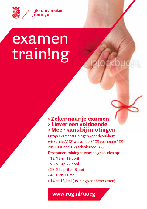
This poster colour scheme is red shapes and types on a white background; and the image is a red knot on a finger.
Base on the colour scheme and the image, it keeps telling me this may be a hospital poster, blood donation or a Social welfare Poster. In fact, this is a academic poster of exam training, so the colour red drags viewers to a wrong direction of the understanding the poster. Also the red knot on a finger has no meaning of any concept of exam or training course, so this image doesn't sent the right message to viewers. Overall the layout of the poster is very good, so if keep the layout and change the red polygon to other colours which represent school, academic, exam or train. I think navy blue(as same as the UBC is using ), orange( as same as the Langara's using) and deep green will be a good choose, because these colours has meanings of academic, professional, study, school etc.
sources:
https://www.facebook.com/photo.phpfbid=10151836477297506&set=a.114820017505.126275.104544627505&type=1&theater
http://www.transportgooru.com/2010/05/dont-talk-while-he-drives-bangalore-city-in-india-delivers-distracted-driving-message-with-stunning-visuals/
http://www.rug.nl/about-us/how-to-find-us/huisstijl/toepassingen/informatiedrukwerk/poster?lang=en


This flash green leaf shape logo is insipid by elements form my mood board. Specially, for the shape, In one of my mood board examples, the white raindrop shape on a transparent green bottle makes the product very identical to the audience. It is very good to match my point of sale as well.I would like to sent a massage to public is that TAZO green tea is flash and organic, so I use flash green instead of white. Also, because my tea bag is in a box, I combine a tea leaf shape with a square box, so here comes my logo of TAZO.

Use in sales
In my products, the entire layout of a point of sale is to create the product appeal: flash, clean, organic. This is done by creating and aesthetic appeal. I design using unique shape and hight contract display to “catch the eye” and leverage the power of persuasion to purchase “this” item it's better than others. In promote the product to be more interesting, I create texture. For example, on the 2oz small metal cycle package, I put texture on a box instead of using plain green paper. Also for the tea bag pack, I create a relief texture with leaf shape on the paper bag, so costumes can touch it and feel it.

Magazine spread
In this magazine spread, I mainly use flash green to branding the green tea products, as well as the lighter red orange for highlight information, such as "organic", or production description. Over all the page, product images, text, and logos work with each other well. All the feelings are very similar as shown from my mood board. Mostly, I stick on the same colour theme as my mood board. Basic on my mood board, I developed more organic and fresh colour , such as green, light orange and light brown; but for the black colour, I get ride of it, this is because it does goes well on my real design. Therefore, I feel mood board it's very useful to create many many different inspirations and good to rely on it; but focusing is more important to designer during the building work. we also should bravely get ride of some unsuitable ideas to keep our mind focus.

I design the website address on the right conner, because it can balance these 2 page, also I care about the margin around the website address, so when readers holding the magazine by two hands (as above shown), they still can see the web address. Moreover, I want to encourage them learn more form the web, so I design a black icon to catch their attention.

Home page
In order to keep my audience focus when browsing my website, I use clean and fresh style to layout the web pages. Look and feel of the website was inspired form my mood board. As same as the magazine pages, I used the same colour, same typeface and same style which are matched the style of my mood board elements.

Information page
The intention behind my design on information page is to encourage traffic flow to all areas. This is also the shopping page, In my design, I am trying to create a overall visual environment that is coherent and inviting. The focus on this page is to deliver solutions of purchasing rather than just look good.

To emphasize the tea products, I use a tea leaf mark as highlight across navigation bar, making the website more interesting and focus to to my product.

Specially, I care about my any audience who with colour blind, so I use photoshop and turn on the "colour blind" function to design every thing, I make sure all the colour theme and layout works well in for everyone regardless of difficulty in reading colours.